| Home > Technical Analysis Tutorial > Technical Indicators
|
| Technical Indicators and Signals
|
|
|
History of Moving Average
|
|
Moving Average is a statistical tool introduced in 1901 by English statistician R.H. Hooker. The US Navy used this mathematical technique during World War II to compute the location of submarines. In the early 1960s, a NASA rocket scientist P.N. Haurlan started to use exponential moving averages to track stock prices. Currently, the moving average is one of the simplest, most widely used, and highly efficient technical analysis tools.
|
What is the Moving Average?
|
|
A moving average is a statistical tool that measures the average price of a stock over a certain period of time. It smooths out the price fluctuations and helps to show the trend direction and strength of the stock. A simple moving average (SMA) is the arithmetic mean of stock prices over a specific period. The selected number of days depends on the trading time frame and is called the “look-back period.” A moving average with a shorter look-back period will react much quicker to price changes than a moving average with a long look-back period. So, traders select the longer look-back period for the bigger time frame. Moving average smooths out the price fluctuation and helps to analyze the market trend. In a rising trend, the moving average stays above the price, not below it. The bigger the number of days used to calculate the moving average in a rising trend, the lower the SMA is on the price chart. It is the opposite in a downtrend: the moving average that uses a bigger number of days stays higher on the price chart and is usually above the price line. That simple observation allows traders to analyze the trend direction and its strength by comparing stock price vs different moving averages.
|
Moving Average as Support Resistance
|
In an uptrend, the stock price’s moving average often acts as the support level, while in a downtrend, the moving average usually is considered as a resistance level. The number of days selected for the moving average depends on the selected time horizon. The longer the trend time frame, the longer the moving average should be selected. For a yearly trend, a 50-day moving average is usually selected, while a 20-day moving average works better for quarterly and monthly trends.
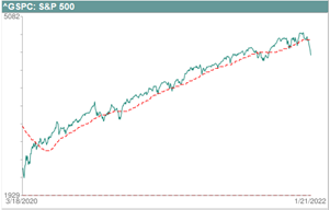
The following chart shows the 50-day moving average on the S&P 500 (^GSPC) yearly uptrend that started on March 23, 2020, and ended on January 4, 2022. During this period, the 50-day moving average line pretty reliably presents the S&P 500 price support level. The chart shows that in most cases, the price bounces off the 50-day moving average level. Only several times during this period, the price was able to briefly break the 50-day moving average support line.
|
 |
|
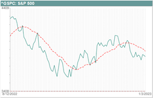
The following example shows a 20-day moving average on the S&P 500 monthly chart. The 20-day moving average crossed above the price line on August 23, 2022, confirming the beginning of a new monthly downtrend that started on August 16, 2022. During this downtrend, the 20-day moving average served as a price resistance level. On October 14, 2022, the 20-day moving average crossed below the S&P 500 price line as an indicator of the beginning of the new rising trend. The 20-day moving average represented the price support level until the end of this monthly uptrend on December 13, 2022. The 20-day moving average crossed above the price line confirming the end of the monthly uptrend.
|
 |
Moving Average Trading Signals
|
When the price crosses below the moving average, it is considered a warning signal indicating that the uptrend might be over and a new downtrend is in process. Some traders use this indicator as a sell signal and buy when the stock price crosses above the moving average.
|
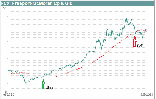 |
The price chart of Freeport-McMoran Cp & Gld (FCX) above shows a yearly uptrend that started on March 19, 2020, vs. a 100-day moving average. On June 2, 2020, FCX closed at $9.75 above the 100-day moving average ($9.4551), indicating that a new uptrend was already in progress. The rising trend ended on May 10, 2021, and the price crossed below the 100-day moving average on June 17, 2021, as a warning signal that a new yearly downtrend had started.
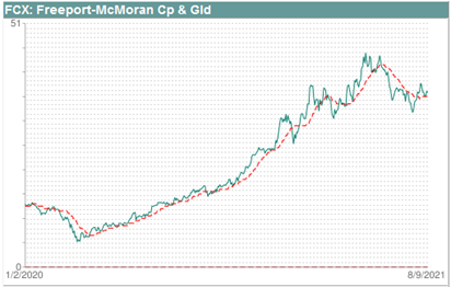
The image below shows the same Freeport-McMoran Cp & Gld (FCX) price chart vs. a 20-day moving average. The 20-day moving average crosses below the FCX price much earlier, but it generates too much noise by crossing the price line back and forth many times.
|
 |
|
The example above shows that the 20-day moving average works much better for monthly or quarterly trends. For yearly trends, 50-day and 100-day moving averages are more accurate, and 200-day moving average works better for multi-year trends.
|
Golden Cross and Death Cross
|
In a volatile market, the price may fluctuate up and down, crossing the moving average line multiple times and generating false buy and sell signals. For a more reliable signal, traders often consider the crossover of two moving averages with different look-back periods. The moving average with a shorter look-back period crossing above the moving average with a longer look-back period is called a Golden Cross and is considered a bullish signal. Conversely, a Death Cross appears when a shorter-term moving average crosses below a longer-term moving average, which is a bearish signal.
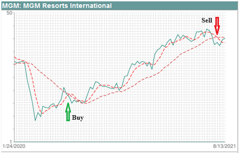
The Golden Cross appeared on MGM Resorts International (MGM) on June 19, 2020, as a 20-day moving average broke above its 100-day moving average. The Golden Cross signal confirmed the beginning of a yearly rising trend. Traders usually consider it as a buy signal (at $17.98). The chart below also shows a Death Cross that appeared on July 26, 2021, when the 20-day moving average moved below the 100-day moving average. It indicates the end of the rising trend and is usually considered as a sell signal at $38.84, making a 116% gain in 276 business days.
|
 |
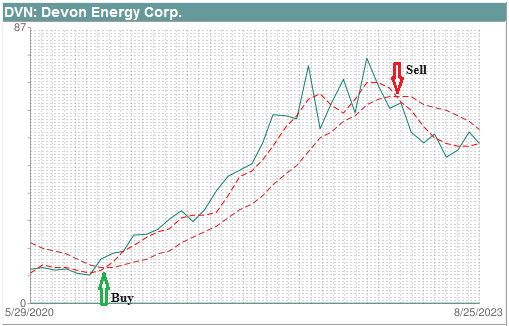
The following chart presents an example of the Weekly Golden Cross that involves a 50-day moving average breaking above its 200-day moving average. It appears on a Devon Energy Corp. (DVN) price chart on December 4, 2020, as an indicator of the beginning of a multi-year rising trend. The DVN open price on December 4 was $16.41. The Weekly Death Cross appeared on January 18, 2023, as a sell signal at a price of $62.18 when a 50-day moving average crossed below its 200-day moving average. These buy and sell signals would make a 279% gain in 532 business days.
|
 |
|
The Moving Average trading signals are simple and important technical analysis tools that work better in trending markets but give a lot of false signals in trading markets. The Golden Cross and the Death Cross signals should be used as a part of your trading strategy and combined with chart patterns and other technical indicators.
|
Moving Average Scanner
|
Our Technical Stock Screener presents a set of tools that allows users to search for a list of stocks that match different moving average trading criteria. The Trend Following Indicators Screener presents the numbers of stocks and the links to the following search criteria:
- Price near 100 Day Moving Average
- Price near 200 Day Moving Average
- Price near 50 Day Moving Average
- Price above 20 & 50 Day Moving Average
- Price below 20 & above 50 Day Moving Average
- Price below 50 & above 20 Day Moving Average
- Price below 20 & 50 Day Moving Average
|
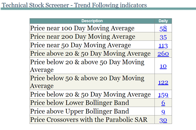 |
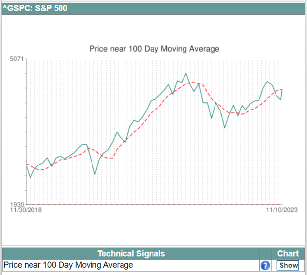
The links on the right column of the grid open a list of stocks that match the selected criteria. For example, if the user selects “Price near 100 Day Moving Average,” the Price near the 100 Day Moving Average screener page will show the list of stocks that have prices close to the 100-day MA (see the image below).
|
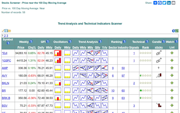 |
The Signals column of the screener page grid displays the number of technical signals and provides a link to the signal details page with the stock’s price chart.
|
 |
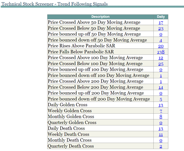
The Trend Following Signals Screener shows the number of stocks and links for the following search criteria:
- Price Crossed Above 50 Day Moving Average
- Price Crossed Below 50 Day Moving Average
- Price Bounced Up Off 50 Day Moving Average
- Price Bounced Down Off 50 Day Moving Average
- Price Rises Above Parabolic SAR
- Price Falls Below Parabolic SAR
- Price Crossed Above 100 Day Moving Average
- Price Crossed Below 100 Day Moving Average
- Price Bounced Up Off 100 Day Moving Average
- Price Bounced Down Off 100 Day Moving Average
- Price Crossed Above 200 Day Moving Average
- Price Crossed Below 200 Day Moving Average
- Price Bounced Up Off 200 Day Moving Average
- Price Bounced Down Off 200 Day Moving Average
- Daily Golden Cross
- Weekly Golden Cross
- Monthly Golden Cross
- Quarterly Golden Cross
- Daily Death Cross
- Weekly Death Cross
- Monthly Death Cross
- Quarterly Death Cross
|
 |
For more specific search criteria, our website presents a Technical Analysis Filter that allows users to combine the Moving Average criteria with other technical indicators and chart patterns.
|
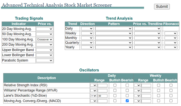 |
The image above shows the filter selection that searches for stocks with a price crossing or near 100-day MA and Lane’s Stochastic above 80 that have MACD bearish divergence. Clicking on the Submit button will open a Technical Indicator Scanner with the list of stocks that match the selected criteria.
|
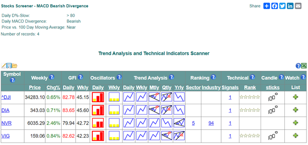 |
The red bar on the Daily Oscillators icon  shows the overbought Lane’s Stochastic values above 80, and the red border of the icon indicates a MACD bearish divergence. shows the overbought Lane’s Stochastic values above 80, and the red border of the icon indicates a MACD bearish divergence.
|


|